![](https://static.wixstatic.com/media/784ad5_f9cafbbd28d64253b259abbdbd52ba0b~mv2_d_4032_3024_s_4_2.jpg/v1/fill/w_767,h_575,al_c,q_85,usm_0.66_1.00_0.01,enc_avif,quality_auto/784ad5_f9cafbbd28d64253b259abbdbd52ba0b~mv2_d_4032_3024_s_4_2.jpg)
Design
Turning research findings into solutions
We synthesized our research findings and shifted to ideating and developing potential solutions. We first developed requirements for our design based on the pain points, desires, and goals identified during the research phase, then shifted to creating storyboards to better understand the contexts in which these design features would be used. Next, we developed an information architecture diagram to determine the application's key features and the overall organization. Finally, we created lo-fidelity and hi-fidelity prototypes.
1
View and edit the details of the wedding day schedule.
2
Allow for organized communication with wedding stakeholders.
3
View the layout of the reception seating chart.
4
Access final list of materials for setting up the wedding.
5
Access a to-do list of tasks to be completed before the start of the wedding.
Storyboards
Once exploring potential solutions through the storyboards, we created an information architecture diagram to determine the high-level structure and organization of the application. Each feature of of the information architecture diagram attempted to address one or more of the design requirements we developed.
Storyboards
Overview
We each created storyboards of a scenario that occurs in a wedding coordinator’s typical day. This allowed us to visualize the components of our design within the context of the wedding coordinator's job.
![Sara's Storyboard](https://static.wixstatic.com/media/784ad5_3d9c5b499e1645efa7f1942657a2974f~mv2_d_1702_1350_s_2.png/v1/fill/w_980,h_777,al_c,q_90,usm_0.66_1.00_0.01,enc_avif,quality_auto/784ad5_3d9c5b499e1645efa7f1942657a2974f~mv2_d_1702_1350_s_2.png)
![Anthea Storyboard](https://static.wixstatic.com/media/784ad5_baa7385191644ae992bfbe1f08dde38d~mv2.jpg/v1/fill/w_980,h_651,al_c,q_85,usm_0.66_1.00_0.01,enc_avif,quality_auto/784ad5_baa7385191644ae992bfbe1f08dde38d~mv2.jpg)
![Theresa Storyboard](https://static.wixstatic.com/media/784ad5_974c715a20254ca985ad6a16564b92c5~mv2_d_4032_3024_s_4_2.jpg/v1/fill/w_980,h_735,al_c,q_85,usm_0.66_1.00_0.01,enc_avif,quality_auto/784ad5_974c715a20254ca985ad6a16564b92c5~mv2_d_4032_3024_s_4_2.jpg)
![Sara's Storyboard](https://static.wixstatic.com/media/784ad5_3d9c5b499e1645efa7f1942657a2974f~mv2_d_1702_1350_s_2.png/v1/fill/w_980,h_777,al_c,q_90,usm_0.66_1.00_0.01,enc_avif,quality_auto/784ad5_3d9c5b499e1645efa7f1942657a2974f~mv2_d_1702_1350_s_2.png)
Takeaways
This process revealed that a mobile application, instead of a tablet or website, made the most sense for our solution, for coordinators already predominantly use their phone, along with paper printouts, to coordinate the wedding day.
Information Architecture
Overview
After exploring potential solutions through the storyboards and keeping the user interviews in mind, we created an information architecture diagram to determine the high-level structure and organization of the application. Each feature of the information architecture diagram attempted to address one or more of the design requirements we developed.
![Preliminary Info Arch Diagram](https://static.wixstatic.com/media/784ad5_bf2cfa924cff40f2ad7c6aaf4855ff98~mv2_d_1332_1458_s_2.jpg/v1/fill/w_980,h_1073,al_c,q_85,usm_0.66_1.00_0.01,enc_avif,quality_auto/784ad5_bf2cfa924cff40f2ad7c6aaf4855ff98~mv2_d_1332_1458_s_2.jpg)
![Info Arch Diagram Brainstorm](https://static.wixstatic.com/media/784ad5_eccbffb6ce84402c8dc1ddb52236caa0~mv2_d_4032_3024_s_4_2.jpg/v1/fill/w_980,h_735,al_c,q_85,usm_0.66_1.00_0.01,enc_avif,quality_auto/784ad5_eccbffb6ce84402c8dc1ddb52236caa0~mv2_d_4032_3024_s_4_2.jpg)
![Preliminary Info Arch Diagram](https://static.wixstatic.com/media/784ad5_bf2cfa924cff40f2ad7c6aaf4855ff98~mv2_d_1332_1458_s_2.jpg/v1/fill/w_980,h_1073,al_c,q_85,usm_0.66_1.00_0.01,enc_avif,quality_auto/784ad5_bf2cfa924cff40f2ad7c6aaf4855ff98~mv2_d_1332_1458_s_2.jpg)
Iterations
Our information architecture diagram went through two major iterations. We developed the first version during a group brainstorm and later translated it to a digital version. However, after completing our paper prototypes (see details in the next section) we realized that our high-level structure needed to be changed based on the flaws we discovered in our app layout. We revised our information architecture diagram based on the hierarchy of the paper prototypes.
![Info Arch New.JPG](https://static.wixstatic.com/media/784ad5_5d25b0bf2fbc408aa752e4b6c17f493f~mv2_d_1330_1643_s_2.jpg/v1/fill/w_600,h_741,al_c,q_85,usm_0.66_1.00_0.01,enc_avif,quality_auto/Info%20Arch%20New_JPG.jpg)
Paper Prototypes
![Home Screen](https://static.wixstatic.com/media/784ad5_bd8c4dcb73cf420a9c7d7c474261936c~mv2_d_2250_3000_s_2.jpg/v1/fill/w_980,h_1307,al_c,q_85,usm_0.66_1.00_0.01,enc_avif,quality_auto/784ad5_bd8c4dcb73cf420a9c7d7c474261936c~mv2_d_2250_3000_s_2.jpg)
![Other Projects Dropdown](https://static.wixstatic.com/media/784ad5_74c63118e7074da29490d9ee5d8fc968~mv2.jpeg/v1/fill/w_980,h_1307,al_c,q_85,usm_0.66_1.00_0.01,enc_avif,quality_auto/784ad5_74c63118e7074da29490d9ee5d8fc968~mv2.jpeg)
![Home Screen](https://static.wixstatic.com/media/784ad5_bd8c4dcb73cf420a9c7d7c474261936c~mv2_d_2250_3000_s_2.jpg/v1/fill/w_980,h_1307,al_c,q_85,usm_0.66_1.00_0.01,enc_avif,quality_auto/784ad5_bd8c4dcb73cf420a9c7d7c474261936c~mv2_d_2250_3000_s_2.jpg)
Overview
After determining the high-level structure of the application through the information architecture diagram, we shifted to creating paper prototypes. Each page on the information architecture diagram represented one of the app’s main pages. Through drawing the prototypes we were able to solidify the different functions each page should have as well as the rough layout and style of the application.
​
Iterations
After completing the first round of prototypes we realized that the scope of one of our features, ”Blueprint”, was too broad and it’s wide array of proposed features did not add value for our user group. Instead, we decided to prototype a more tailored “Seating Chart” feature.
Key Features
Other than the home screen, our app has four key features.
![Main Schedule Page 1](https://static.wixstatic.com/media/784ad5_9d80f5bb1ceb412e8a5c2055aeef2521~mv2_d_3024_4032_s_4_2.jpg/v1/fill/w_980,h_1307,al_c,q_85,usm_0.66_1.00_0.01,enc_avif,quality_auto/784ad5_9d80f5bb1ceb412e8a5c2055aeef2521~mv2_d_3024_4032_s_4_2.jpg)
![Clicking On an Event 2](https://static.wixstatic.com/media/784ad5_a3745803a8a24e60b2470613a409e31b~mv2_d_3024_4032_s_4_2.jpg/v1/fill/w_980,h_1307,al_c,q_85,usm_0.66_1.00_0.01,enc_avif,quality_auto/784ad5_a3745803a8a24e60b2470613a409e31b~mv2_d_3024_4032_s_4_2.jpg)
![Changes Reflected](https://static.wixstatic.com/media/784ad5_07e8f19853f240e69b634b596140591e~mv2_d_3024_4032_s_4_2.jpg/v1/fill/w_980,h_1307,al_c,q_85,usm_0.66_1.00_0.01,enc_avif,quality_auto/784ad5_07e8f19853f240e69b634b596140591e~mv2_d_3024_4032_s_4_2.jpg)
![Main Schedule Page 1](https://static.wixstatic.com/media/784ad5_9d80f5bb1ceb412e8a5c2055aeef2521~mv2_d_3024_4032_s_4_2.jpg/v1/fill/w_980,h_1307,al_c,q_85,usm_0.66_1.00_0.01,enc_avif,quality_auto/784ad5_9d80f5bb1ceb412e8a5c2055aeef2521~mv2_d_3024_4032_s_4_2.jpg)
![Main Checklist Page 1](https://static.wixstatic.com/media/784ad5_78543216bba142b8a900e46b6b310dd8~mv2_d_3024_4032_s_4_2.jpg/v1/fill/w_980,h_1307,al_c,q_85,usm_0.66_1.00_0.01,enc_avif,quality_auto/784ad5_78543216bba142b8a900e46b6b310dd8~mv2_d_3024_4032_s_4_2.jpg)
![Checking Off Flower Arrangements 2](https://static.wixstatic.com/media/784ad5_6edbafa731fb4648962801c8f8dd165d~mv2_d_3024_4032_s_4_2.jpg/v1/fill/w_980,h_1307,al_c,q_85,usm_0.66_1.00_0.01,enc_avif,quality_auto/784ad5_6edbafa731fb4648962801c8f8dd165d~mv2_d_3024_4032_s_4_2.jpg)
![Changes Reflecting On Page 3](https://static.wixstatic.com/media/784ad5_5a252d9fae774297b3d208d456154503~mv2_d_3024_4032_s_4_2.jpg/v1/fill/w_980,h_1307,al_c,q_85,usm_0.66_1.00_0.01,enc_avif,quality_auto/784ad5_5a252d9fae774297b3d208d456154503~mv2_d_3024_4032_s_4_2.jpg)
![Main Checklist Page 1](https://static.wixstatic.com/media/784ad5_78543216bba142b8a900e46b6b310dd8~mv2_d_3024_4032_s_4_2.jpg/v1/fill/w_980,h_1307,al_c,q_85,usm_0.66_1.00_0.01,enc_avif,quality_auto/784ad5_78543216bba142b8a900e46b6b310dd8~mv2_d_3024_4032_s_4_2.jpg)
![Seating Chart Home Screen 1](https://static.wixstatic.com/media/784ad5_0d19c311f3eb469193480be5dd8deb78~mv2_d_3024_4032_s_4_2.jpg/v1/fill/w_980,h_1307,al_c,q_85,usm_0.66_1.00_0.01,enc_avif,quality_auto/784ad5_0d19c311f3eb469193480be5dd8deb78~mv2_d_3024_4032_s_4_2.jpg)
![Start a Search 2](https://static.wixstatic.com/media/784ad5_16cfd3b0031040ce88500e0863cedee6~mv2_d_3024_4032_s_4_2.jpg/v1/fill/w_980,h_1307,al_c,q_85,usm_0.66_1.00_0.01,enc_avif,quality_auto/784ad5_16cfd3b0031040ce88500e0863cedee6~mv2_d_3024_4032_s_4_2.jpg)
![Move Reflected on Screen 11](https://static.wixstatic.com/media/784ad5_a40aa8e987dc4228b6e13946509f50cd~mv2_d_3024_4032_s_4_2.jpg/v1/fill/w_980,h_1307,al_c,q_85,usm_0.66_1.00_0.01,enc_avif,quality_auto/784ad5_a40aa8e987dc4228b6e13946509f50cd~mv2_d_3024_4032_s_4_2.jpg)
![Seating Chart Home Screen 1](https://static.wixstatic.com/media/784ad5_0d19c311f3eb469193480be5dd8deb78~mv2_d_3024_4032_s_4_2.jpg/v1/fill/w_980,h_1307,al_c,q_85,usm_0.66_1.00_0.01,enc_avif,quality_auto/784ad5_0d19c311f3eb469193480be5dd8deb78~mv2_d_3024_4032_s_4_2.jpg)
![Clients Contacts Page 1](https://static.wixstatic.com/media/784ad5_10aea503b0fd4a04bf1d47bc8a55dfcd~mv2_d_3024_4032_s_4_2.jpg/v1/fill/w_980,h_1307,al_c,q_85,usm_0.66_1.00_0.01,enc_avif,quality_auto/784ad5_10aea503b0fd4a04bf1d47bc8a55dfcd~mv2_d_3024_4032_s_4_2.jpg)
![Clicking Mother of Bride 2](https://static.wixstatic.com/media/784ad5_7360f7329868475cbbbbd30dcd042061~mv2_d_3024_4032_s_4_2.jpg/v1/fill/w_980,h_1307,al_c,q_85,usm_0.66_1.00_0.01,enc_avif,quality_auto/784ad5_7360f7329868475cbbbbd30dcd042061~mv2_d_3024_4032_s_4_2.jpg)
![Hang Up Call 6](https://static.wixstatic.com/media/784ad5_632e244a02454f81b44bf6d0f8cd0c50~mv2_d_3024_4032_s_4_2.jpg/v1/fill/w_980,h_1307,al_c,q_85,usm_0.66_1.00_0.01,enc_avif,quality_auto/784ad5_632e244a02454f81b44bf6d0f8cd0c50~mv2_d_3024_4032_s_4_2.jpg)
![Clients Contacts Page 1](https://static.wixstatic.com/media/784ad5_10aea503b0fd4a04bf1d47bc8a55dfcd~mv2_d_3024_4032_s_4_2.jpg/v1/fill/w_980,h_1307,al_c,q_85,usm_0.66_1.00_0.01,enc_avif,quality_auto/784ad5_10aea503b0fd4a04bf1d47bc8a55dfcd~mv2_d_3024_4032_s_4_2.jpg)
Takeaways
The paper prototypes allowed us to quickly determine any problems in our design through testing with users, a process we outline in more detail in the next section.
1
Schedule
2
Checklists
3
Seating Chart
4
Contacts
Usability Testing
Overview
We tested our paper prototypes with four participants: one wedding coordinator and three of whom had experience planning events. With our users we tested five key path scenarios:
-
Edit an event on the wedding day schedule
-
Find and adjust the seating placement of a guest on the seating chart
-
Check off that the flower arrangements have arrived
-
Call the mother of the bride
-
Access another wedding project
Takeaways
These usability tests helped to identify the strengths and weaknesses of our design. Our main findings were that the schedule editing feature did not have an intuitive interface and the movement of individuals on seating chart caused confusion. However, users found the app’s organization to be clear and thought that the app’s main features were useful for event and wedding coordinating. We used these findings to make changes to our annotated wireframes.
Wireframes
Overview
Once receiving feedback on our paper prototypes during our usability tests, we created annotated wireframes. The annotated wireframes outlined the layout, text, and content on each page. Although the wireframes were a deconstructed version of the final application, they transformed Hitched into a more concrete concept, and gave us a sense for what the application would ultimately look like.
![Slide2](https://static.wixstatic.com/media/784ad5_f51d47fc5d3441ec85a3735f2b7df62a~mv2.jpg/v1/fill/w_960,h_540,al_c,q_85,enc_avif,quality_auto/784ad5_f51d47fc5d3441ec85a3735f2b7df62a~mv2.jpg)
![Slide3](https://static.wixstatic.com/media/784ad5_0a87801c5ee34c33aad7d2fef868a41a~mv2.jpg/v1/fill/w_960,h_540,al_c,q_85,enc_avif,quality_auto/784ad5_0a87801c5ee34c33aad7d2fef868a41a~mv2.jpg)
![Slide39](https://static.wixstatic.com/media/784ad5_5eb8a4f18ec84b9db7846668e349dd7e~mv2.jpg/v1/fill/w_960,h_540,al_c,q_85,enc_avif,quality_auto/784ad5_5eb8a4f18ec84b9db7846668e349dd7e~mv2.jpg)
![Slide2](https://static.wixstatic.com/media/784ad5_f51d47fc5d3441ec85a3735f2b7df62a~mv2.jpg/v1/fill/w_960,h_540,al_c,q_85,enc_avif,quality_auto/784ad5_f51d47fc5d3441ec85a3735f2b7df62a~mv2.jpg)
Takeaways
After feedback on our wireframes, we realized that the home screen from our paper prototypes was redundant since we have a navigation bar. Instead, the home screen should instead provide a quick snapshot of the app’s contents for the coordinator. Additionally, the wireframes highlighted a need for consistent spacing and alignment. These changes had a large impact on our high-fidelity prototypes.
High-Fidelity Mockups
![1 Home Screen](https://static.wixstatic.com/media/784ad5_14e4a66677154638b95064e02ec5ef09~mv2.png/v1/fill/w_744,h_1322,al_c,q_90,enc_avif,quality_auto/784ad5_14e4a66677154638b95064e02ec5ef09~mv2.png)
![2 Master Schedule](https://static.wixstatic.com/media/784ad5_a5b1ad336c69484bb07673e1c3729e06~mv2.png/v1/fill/w_737,h_1310,al_c,q_90,enc_avif,quality_auto/784ad5_a5b1ad336c69484bb07673e1c3729e06~mv2.png)
![5 Seating Chart Table](https://static.wixstatic.com/media/784ad5_2fc7dea482b847a1983deb2db7ec17ea~mv2.png/v1/fill/w_734,h_1305,al_c,q_90,enc_avif,quality_auto/784ad5_2fc7dea482b847a1983deb2db7ec17ea~mv2.png)
![1 Home Screen](https://static.wixstatic.com/media/784ad5_14e4a66677154638b95064e02ec5ef09~mv2.png/v1/fill/w_744,h_1322,al_c,q_90,enc_avif,quality_auto/784ad5_14e4a66677154638b95064e02ec5ef09~mv2.png)
Overview
Due to the scope of the project, we focused on three key features of our application for the high-fidelity mockup. Although our high-fidelity mockups are similar to our wireframes, some notable changes were made.
​
Home
On our home screen, we added important client contacts to the "at a glance" home screen so they were more easily accessible.
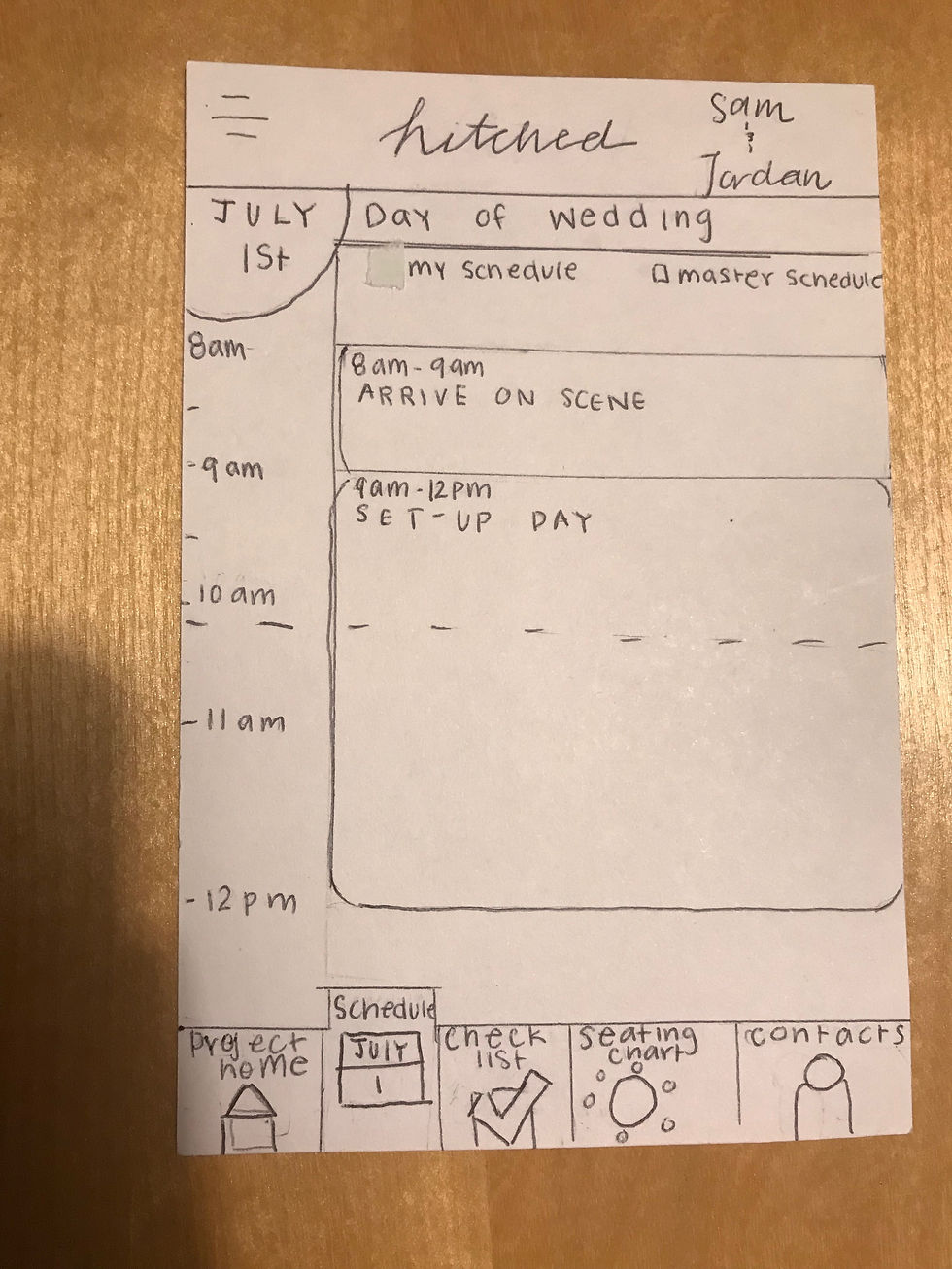
​
Schedule
After feedback from a wedding coordinator, we readjusted our scheduling feature design to better accommodate the packed schedule of a coordinator. We additionally discovered that our original concept of “my schedule” and “master schedule” was inaccurate, and drew from an actual wedding coordinator’s schedule to create the high-fidelity mockup. The master schedule includes every event that the coordinator has to keep track of, while the guest timeline filter are events only relevant to the wedding guests.
​
Seating Chart
On our seating pathway, as noted in the wireframes section, we changed our screens to accommodate feedback from our usability test. We created a more holistic display in which the user selects a table and all the guests seated there are listed, in addition to the existing "find guest" feature.
Colors
Regarding our color choices, we extensively researched wedding palettes and inspiration, and found that pink, black, and white would suit the app the best. The pink gives a comforting and connected feel, while the black and white represent the clean, classy aspect of a wedding.
​